In an ideal world, every company would have its own typeface. Since that is usually not feasible or affordable, many companies end up sharing the same one.
Unless you are working for Apple or Nike, who are spending billions to be recognized by a simple icon alone, a huge part of brand recognition will be carried by your client’s business name. It might be accompanied by a symbol either set apart or integrated into the type but one thing is crystal-clear: it won’t be complete without the company’s name standing tall.
The best way to make a company’s name stand out — finding the prefect typeface to show it in. Here is were the designer’s challenge comes into play. As designers, we have to find ways to make the logo original even when we opt for a more generic font. First, we make sure we are looking at typefaces that are okay to use so the client doesn’t get into legal trouble. Second, we make sure the kerning — the space between the letters — is absolutely beautiful while also adjusting letters of the type to make it completely unique. Lastly, we have to be aware of the technical side of handing over the new-and-improved typeface to the client.
Woowe, seems like a lot — let’s talk some type!
The problem with free fonts
_
Heard of DaFont.com and other free font resources? Sure you have! They tempt us to expand our type collections because they are free and easy to access after all… right?
Not always. There are 2 problems with free fonts:
- Their kerning and edges are often crappy and unclean
- They aren’t always free, at least not for designers working commercially
1. Are free fonts really free?

It’s important to realize anyone can upload fonts to these free sites. These sites are sometimes riddled with stolen fonts even though those who upload are responsible for copyright issues.
In addition, people copy and upload well-known fonts like Disney, Twilight and Diddl. If the font is a copy of a well-known typeface from a movie or popular brand (i.e. Harry Potter, Twilight, Coca Cola, etc) — marking it as “free” doesn’t make it okay to use commercially.
This is a nice and grungy font most of you know. On the right you will see it says “Free for personal use.” This means it isn’t permitted for commercial use – and yes, designing logos for clients is commercial use.
Really research the typefaces you use — just because they are free doesn’t mean they are legal to use.
2. Crappy kerning
If you want an example of crappy kerning, look no further than the font-de-jour: Harabara.
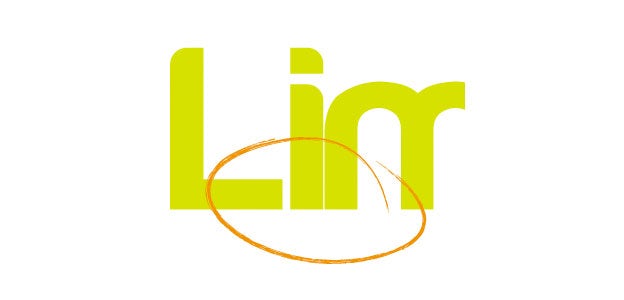
The kerning between single letters varies tremendously with any typeface. Crappy kerning might not seem dramatic on a tiny web banner but it looks plain horrid on a billboard. Professional designers have a feel for getting the kerning right. Sorry, Harabara ain’t it.
When you look at a logo in different sizes, the distance between single letters must remain pleasing to the eye. Professional typefaces usually manage pleasing kerning, though some letter combinations are challenging like the letters i and t. If in doubt, make sure the distance between letters is always the exact same — I usually check distance by drawing a square and moving it between each letter.
3. Unclean vectors
You will notice how sloppy a font is when you’ve outlined it and begin to make adjustments. Another example of a crappy, yet free font? Comfortaa.
Take the letter “T”; it looks harmless, nice and round. But convert it into outlines (a quick way to outline is right clicking it and selecting “Create Outline”) then zoom in and notice as the harmless “T” turns ugly with uneven horizontal line.
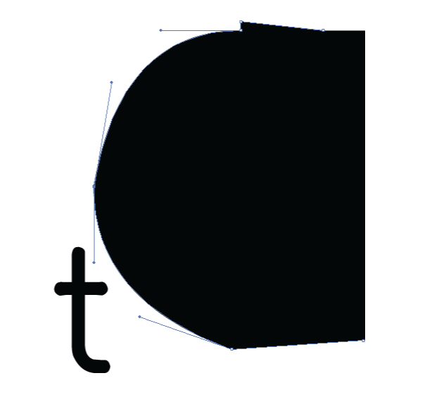
It’s not just unprofessional to burden clients with uneven vectors, it is also a liability. Imagine having to do vinyl cuts for your shop window, then having tiny ragged lines… that won’t work.
If you nevertheless decide to go for one of those messy fonts, you will spend a lot of time cleaning them up before handover.
How to clean up a font
_
If you insist on using a font like Harabara, you’ll need to clean it up before handing the files to a client. Here is a step-by-step on how to achieve this. Convert the type to outlines by selecting Type > Create Outlines (or right clicking and selecting Create Outlines).
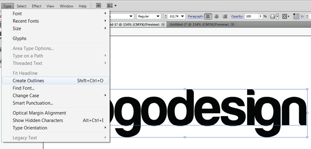
Vectorized letters have appeared — notice the anchor points on each letter.

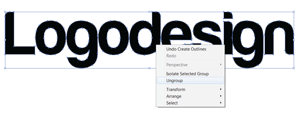
Clean up the shoddy vectors – look for bumps, unnecessary anchor points, etc.
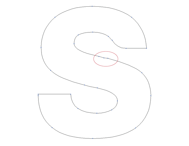
Fix any kerning issues. In this case, the i and g are too close are overlapping so I’m going to space them apart.
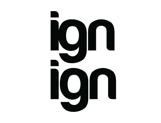
Make any other edits you see fit — you are done!
When are free fonts okay?
_
The good news… some free fonts are well-designed, executed and free to use! My current favorite typeface is a classic from 1903 and therefore in the Public Domain: League Gothic. Another free font that is pretty well designed: Lobster.
More good news: it pays to purchase. You buy a typeface once then use it on more than one project, and eventually they are worth the investment.
Make your own (or adjust existing type)
_
I am not necessarily talking about making your own typeface—although that is possible, it’s usually a lot of work. But it is quite easy to adjust a typeface in Illustrator so you change it from generic to unique. When starting this endeavor, all you have to do is convert the type to outline then start adjusting the vectors.
Here are just three quick-and-dirty examples of Myriad. The original:
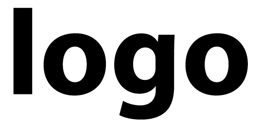
Now two adjusted variations:
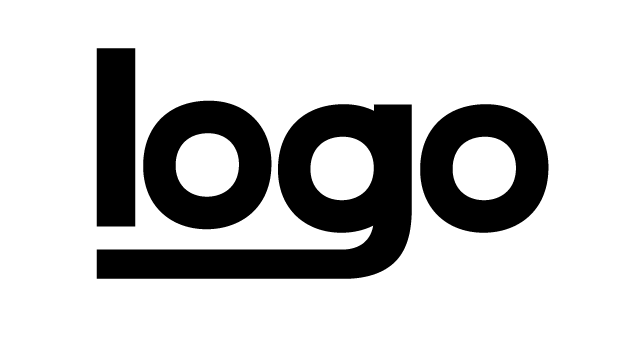
Often, it is enough to adjust one or two letters — there is no limit to how subtle or extensive you make the adjustments. Just as long as it works for the client.
The upside is that the typography will be unique. The downside? The client cannot install the font since it is vector-based.
Handing files over to clients
_
Have you ever received a PDF or file where either: the whole thing looked different than expected, or the software immediately started bitching that fonts were missing?
This means the file has fonts the recipient doesn’t have installed on his computer. Since logos go through many, many hands (designer, client, employee, local printer, online service, etc.) it is essential that all type is converted to outlines. That means it is no longer type, but a graphic.
Nevertheless, sometimes clients want to have the font (for instance, they need to update their business card template). The correct way to do this? Let the client know the name of the font and point them to its source. So yes, clients often have to shell out extra money.
That’s all, folks!
_
Time for some fun work:
- Go through your installed typefaces.
- Check to see if you can use them commercially. If you can’t find where you downloaded them, then Google for it.
- Delete any typefaces you can’t use commercially (so you don’t accidently end up using it for a client)
- Post any questions you have – we will get them answered 🙂
A huge thanks to designer Gila von Meissner (aka Cross the Lime) for this type-tastic tutorial! If you need more advice, she’s the expert.


