Logo & brand design for second hand children's brand

1
Ontworpen op 99designs van Vista
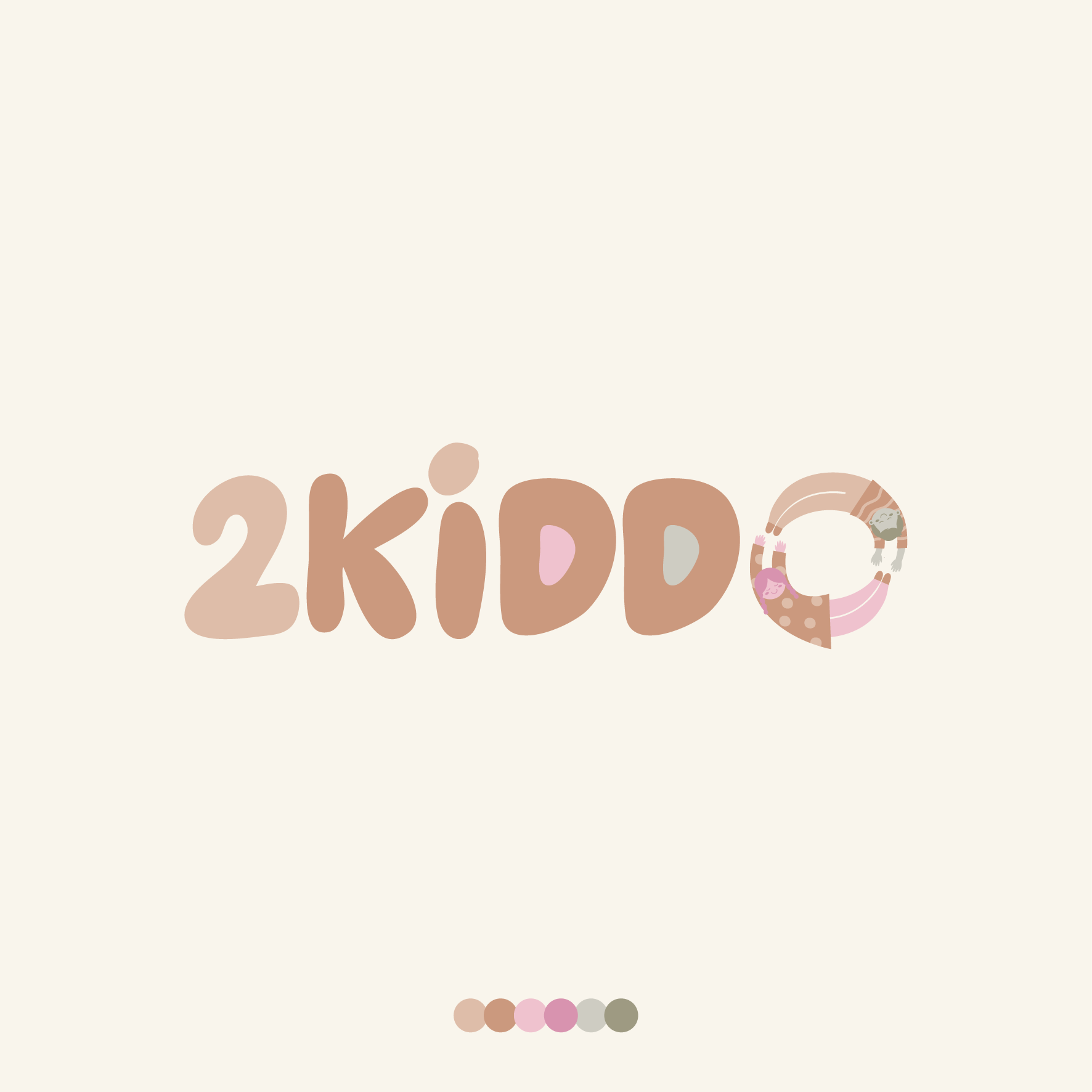
The client was looking for a new logo for their online marketplace for secondhand children's goods.
The design was centred around using the 2 children as a circular, interlocking symbol to reflect the recycling icon.
This way the symbol features 2 children (2kiddo) and the idea of re-using/re-cycling second hand goods.
The client then took the lead with their preferred color palette.