Logo for Steel Building Business

1
Ontworpen op 99designs van Vista
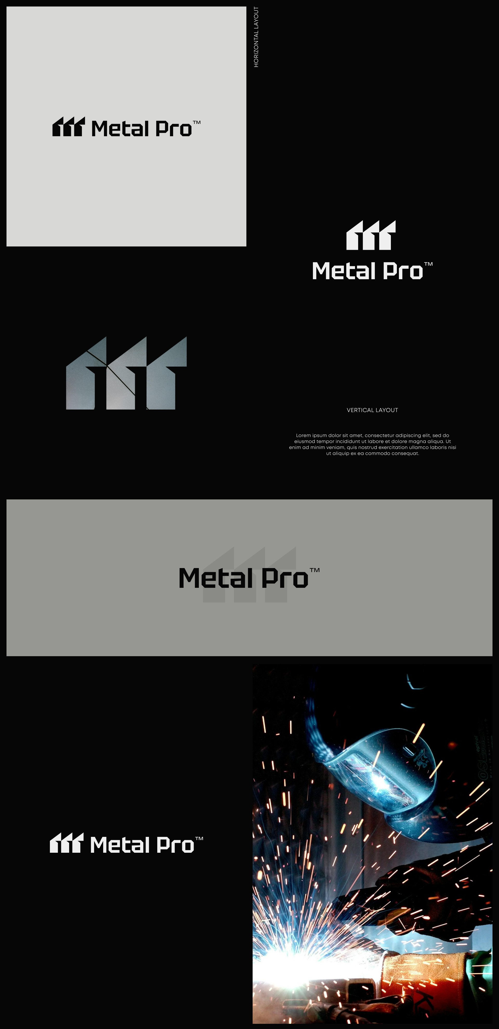
The three geometric elements in the logo symbolize abstractly, the steel frames used in your industry and cleverly form the letter "M," which stands for Metal Pro. This design choice serves as a visual metaphor for the company’s core values: strength, precision, and innovation. The triadic structure emphasizes the company's ability to provide sturdy, precisely engineered, and cutting-edge solutions for various building needs. The logo’s clean lines and balanced composition create a strong visual identity that is both memorable and indicative of the company's expertise in the steel construction industry.