The logo colors of marketing
Harness the psychology of color to build your brand.

by Pinch Studio
Marketing logo colors: now in technicolor!
The marketing industry is a bit of a paradox when it comes to marketing logo colors. Many brands want to appear young and modern, but they don’t want their logos to stray too far from the traditional. And considering some of the bigger agencies date back to the 1800s, what you get is a lot of logos modeled on old-fashioned trends but with noticeably modernized upgrades.
The challenge in choosing the right marketing logo colors, at least today, is to appeal to both sides. Communications brands want the professionalism of yesterday with the dazzling appeal of tomorrow. Logos have to be flashy enough to attract clients, but formal enough to be taken seriously.
To help make sense of this contradiction, we here at 99designs went through 210 design projects for the marketing & PR industry to see what we could learn. We looked at the colors those clients requested as well as the brand traits they prioritized in their brief and the colors that depicted those traits. We then compared these results to the colors chosen by marketing industry leaders to see where they matched and where they disagreed. You’ll find all our results below to help you choose the best marketing logo colors to market yourselves.
To help make sense of this contradiction, we here at 99designs went through 210 design projects for the marketing & PR industry to see what we could learn. We looked at the colors those clients requested as well as the brand traits they prioritized in their brief and the colors that depicted those traits. We then compared these results to the colors chosen by marketing industry leaders to see where they matched and where they disagreed. You’ll find all our results below to help you choose the best marketing logo colors to market yourselves.
Blue marketing colors are not so out of the blue
-
 The most popular marketing logo colors in 99designs and among industry leaders, set next to their popularity across all industries. All data visualizations designed by MH Designs.
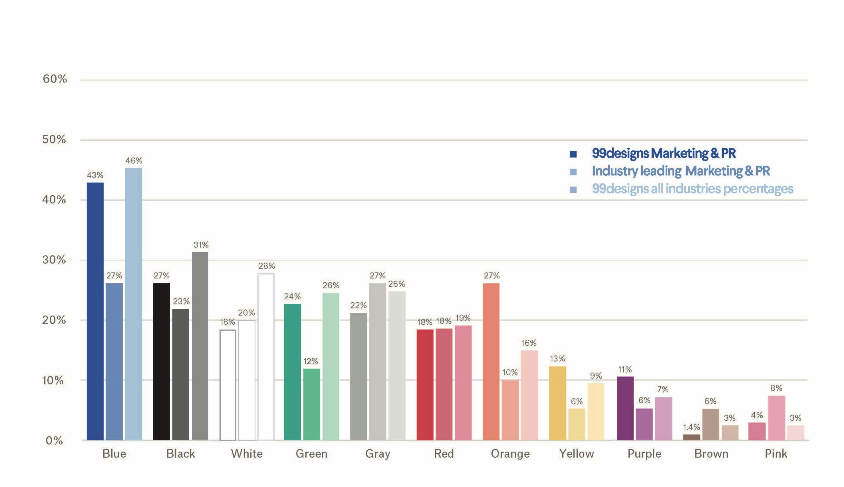
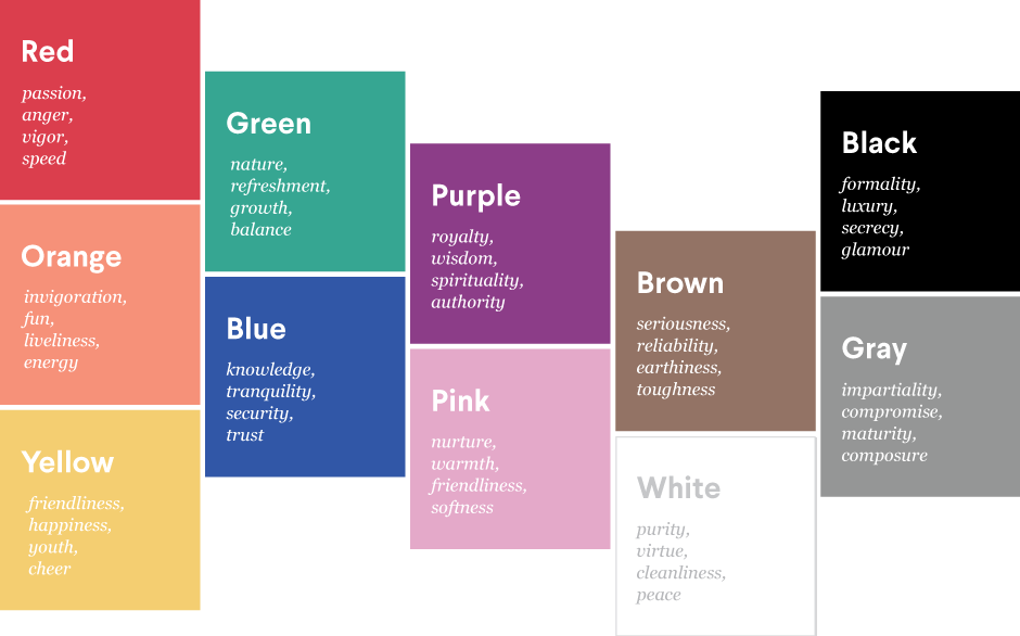
Blue dominates the requests for marketing & PR logo colors at nearly half (43%). According to our branding colors guide, blues signify friendliness and trust at lighter shades and professionalism and security at darker shades. Both of these traits suit marketing & PR firms, whom clients are entrusting with their entire image.
Black, white and gray—popular marketing colors in all industries—are particularly prevalent in marketing & PR thanks to their classical, even formal, associations. It also helps that they cater to every market, making them a safe bet for attracting clients of every industry.
Least popular, both for 99designs requests and among industry leaders, are purple, brown and pink, all contentious colors. Generally speaking, pinks and purples appeal more to women while browns appeal more to men. For companies that deal with popularity, it makes sense to stick with universal crowd-pleasers.
Although you can’t see it from the graph, we also found that industry leading marketing & PR companies preferred one dominant bold color. If they had a secondary color, it tended to be gray, which would highlight the dominant color rather than distract from it.
How the marketing experts market themselves
It’s interesting to see how the marketing & PR industry leaders choose to brand themselves, since they, more than any other industry, have some extra insight into branding.
Among the four giants above, we see a lot of different approaches in marketing logo colors, but also some consistent similarities. The biggest marketing agency in the world, WPP, uses a standard and straightforward approach that doesn’t ruffle any feathers. Their black, seriffed monogram presents a no-nonsense, strictly professional approach. For this, black is the best choice, as the most dominant color in the spectrum, not to mention how it works with the typography to generate a traditional feel.
Publicis Groupe, France’s number one marketing agency, uses muted gold and black for their logo colors, which go well together. Gold represents both prosperity and antiquity, while muting the brightness makes it appear more formal and serious. This juxtaposes with the stark black of their brand name, which captures most of the eye’s attention.
Interpublic Group is the biggest communication brand that uses blue, and they use it well. The three different shades utilize both light and dark blues’ benefits mentioned above, and presents them in a creative and unique way. This makes their logo stand out from their competitors’ logos, which lean more towards formality, as with WPP.
And speaking of standing out, Ogilvy’s new logo takes advantage of the attention-grabbing red to differentiate themselves with the competition. Ogilvy recently rebranded itself after 70 years of stagnancy, an initiative that encompassed a new logo, website, company values, and promoting more women to partner. Their new logo features a softer, less aggressive red than the one in the past, but they keep a degree of professionalism with the classic serif font for their name. The color change makes them seem younger and more modern, for which red was a smart choice, as we explain below.
Which marketing colors show your brand’s personality?
Start determining your brand personality by asking yourself these six questions:
- Gender: Is my brand traditionally masculine or feminine?
- Tone: Is my brand playful or serious?
- Value: Is my brand luxurious or affordable?
- Time: Is my brand modern or classic?
- Age: Is my brand youthful or mature?
- Energy: Is my brand loud or subdued?
We'll use your answers to see what logo color works best for you.
Here's how marketing & PR businesses on 99designs define their brand personalities:
-
We analyzed the preferences of all industries and assumed normal distribution. Preference strength was figured on number of standard deviations from the mean.

Understandably, marketing & PR firms wanted to be seen as more modern and luxurious. After all, most companies wouldn’t put their faith and money in an outdated or cheap agency. One somewhat unexpected result was the strong preference for appearing young—perhaps related to appearing modern, or simply just a marketing strategy to net younger brands as clients.
We asked our color experts to analyze these results, and here’s their input:
We asked our color experts to analyze these results, and here’s their input:
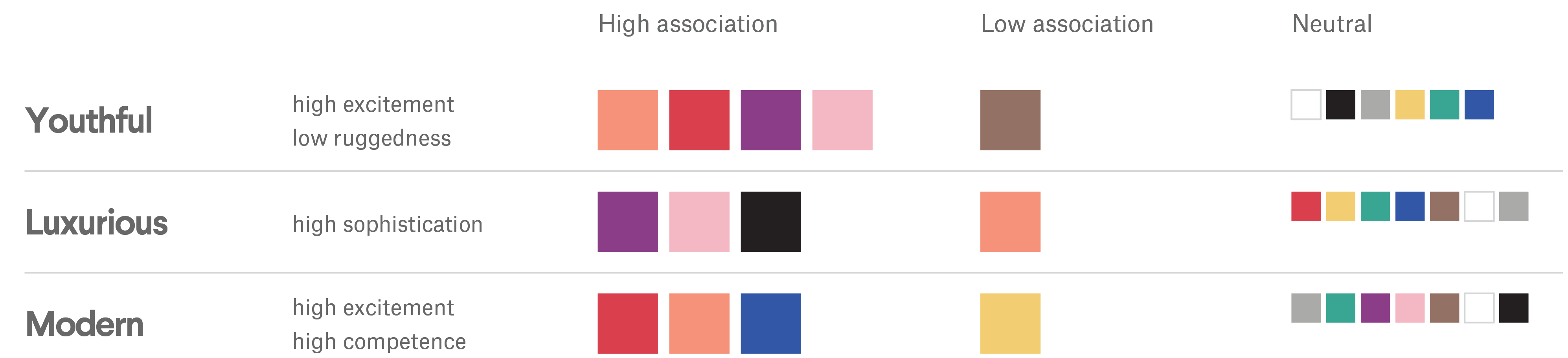
Based on these traits, we’d expect to see more warm colors: red, orange and yellow. We received a fair amount of requests at 99designs for red and orange, but yellow was lacking for some reason— even among industry leaders. Perhaps it’s because yellow tends to represent economy brands, while most marketing agencies strive for luxury.
And for appearing luxurious, black is a solid choice. Considering that black is also associated with being modern, it’s easy to see why it’s such a staple among marketing logo colors.
As we mentioned above, blue is an inviting and trustworthy color—a favorite of banks, who must earn clients trust in handing over the hard-earned money. Similarly, communication companies must earn their clients trust before handling their public image, which perhaps explains blue’s popularity, even though it doesn’t represent the personality traits most marketing brands expressed as important.
How to communicate to clients with colors
The most important role of your marketing logo colors is to communicate what kind of brand you are to potential clients. You want to present yourself a certain way so that clients have the best impression of you before the first meeting even takes place.
That’s the duty of designers hired to create marketing & PR logos, regardless of the size of the company. Boutique agencies, niche brands, marketing & PR consultants, and young agencies just starting out need the same care with their branding as the industry leaders. Looking at some of our actual designs done for these types of marketing professionals below, you can see similar threads carried over from the industry leaders.
-
Logo design by AC Graphics for White Space.
-
Edge Communications logo by KisaDesign.
-
Danville Digital logo by aleT.
The logo for White Space shows us the traditional black-and-white color scheme works just as well for smaller niche marketing brands as it does for established agencies like WPP.
The noticeable difference is that these smaller brands have more freedom to use experimental and modern designs. While still conservative, White Space takes advantage of recent minimalist trends to appear more modern.
That’s not to say smaller marketing agencies can’t still follow in the footsteps of the larger firms. Edge Communications makes good use of blues to generate trust, but still appears young and modern with its abstract logo design and sans serif font.
Likewise, Danville Digital uses a similar muted gold as Publicis Groupe to communicate a classic and luxurious brand. However, just like Edge Communications, their abstract logo and sans serif font gives their brand a more modern slant than their predecessor companies.
As a marketing agency manager or a PR consultant, it’s not necessarily your job to understand these advanced color guidelines, let alone apply them to your brand visuals—that’s what designers are for. Check out our best communications designers here.
Blue collar, white collar, purple collar: what are the logo colors of other industries?
Get a marketing logo design now!
Want to know more about how design impacts business?
Subscribe and be inspired by our best tips, trends and resources.
We'll also send you the occasional marketing email and promotion (which you can opt-out of anytime).